
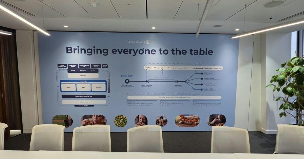
A mismatched interior can cost a business clients before anyone says a word. Faded logos, clashing colours, and signs that look like they came from three different companies make a capable team seem disorganised. Visitors take in the walls, the entrance, and the way the brand carries through each room, and they decide what kind of company they’re dealing with long before they read a proposal or meet the team.
Visual identity fixes that by giving an interior a clear sense of purpose. It ties the logo, colour palette, typography, and materials into one consistent look, so every area of the building feels like it belongs to the same business. Done well, it builds trust quietly and makes the company easier to remember.
How Visual Identity Shapes Commercial Interiors
Here’s how a clear visual identity changes the way clients and staff experience a commercial space:
1. Creating Instant Brand Recognition at the Entrance
The entrance and reception area set expectations for the whole visit. Clients walk in, look around, and form an opinion of the business within seconds. A bare wall or a generic sign gives them nothing to hold on to, and the space quickly feels forgettable.
A company logo wall sign behind the front desk fixes that straight away. It confirms visitors are in the right place and puts the brand at the centre of their first impression. Paired with lighting that picks out the edges of the lettering, it gives reception a finished, confident feel that stays with clients long after the meeting ends.
2. Reflecting Brand Personality Through Materials
Materials carry meaning. Brushed metal feels precise and corporate, timber feels warm and approachable, and polished finishes suggest quality and attention to detail. The right mix tells clients something about the business before anyone explains what it does.
A gold acrylic sign is a good example. Its mirrored finish catches the light and adds a premium touch without the weight or cost of solid metal. It suits law firms, financial practices, beauty brands, and hospitality spaces that want to look polished. Used consistently across reception, meeting rooms, and display areas, it gives the interior a recognisable signature.
3. Keeping the Brand Consistent From Room to Room

A strong reception area loses its effect if the rest of the office feels disconnected. Clients notice when the boardroom uses different fonts, or when one corridor has signs in a colour that appears nowhere else. Small gaps like these make the brand feel patched together.
An office wall sign in each key space helps carry the brand through the building. Matching typefaces, colours, and finishes create a joined-up journey from the front door to the meeting room. Clients often read that consistency as proof that the business runs its projects with the same care.
A Few Ways To Keep Signage Consistent:
- Use one approved set of brand colours and typefaces on every sign
- Keep mounting heights and spacing the same throughout the building
- Pair materials so finishes feel related across different rooms
- Keep a simple style guide for future sign orders
- Check new signage against existing pieces before installation
4. Supporting Staff Morale and Pride
Visual identity isn’t only for visitors. Staff spend far more time in the building than any client, and the space around them affects how they feel about their work. A well-branded office reminds teams who they work for and what the company stands for.
When people feel proud of their workplace, they’re more relaxed about bringing clients in, and that confidence shows in meetings. A tired, unbranded office does the opposite, leaving staff with the sense that the business doesn’t value its own image.
5. Making Spaces Easier to Remember
Clients visit plenty of offices, showrooms, and commercial premises. The ones that stick in their minds usually have a clear, distinctive look. A feature wall, a bold colour used with restraint, or a logo display with real presence gives people something to recall when they think about the business later.
That memorability has commercial value. A client who remembers the space is more likely to remember the company, recommend it to others, and come back.
6. Keeping Pace With Brand Changes
Brands evolve. Logos get refreshed, colour palettes shift, and businesses grow into new services. Interiors that still show an old identity send mixed messages and make the company look behind the times. Clients spot these mismatches quickly and wonder what else the business has let slip.
Planning signage with updates in mind makes these changes far easier. Modular panels, removable lettering, and adaptable mounting systems let businesses refresh the look without a full refit, keeping the interior in step with how the brand looks today.
Building a Visual Identity That Works
Visual identity in commercial interiors goes well beyond decoration. It shapes first impressions, builds trust, and gives clients a clear sense of what a business values. Every sign, finish, and colour adds to that picture.
With consistent branding, quality materials, and a plan for future updates, an interior becomes a working part of the brand. It helps clients feel confident in the business and gives staff a space they’re proud to represent.
READ ALSO: Finding the Right Clinic for Either Men’s Hair Loss or a Female Hair Transplant in London
